How to Add a Video Source
Today we’re going to talk about how to bring multiple sources to the screen at the same time., the multi-views.
You can see multi-views all the time on television, especially if you watch the news when you see one person talking and another source over here or a PowerPoint or things like that. Thankfully built into the YoloBox (the pro and the original), you have a way to put multiple different kinds of multi-views on the screen and I wanted to walk you through some of these choices. Down here you can see I have added a video source.
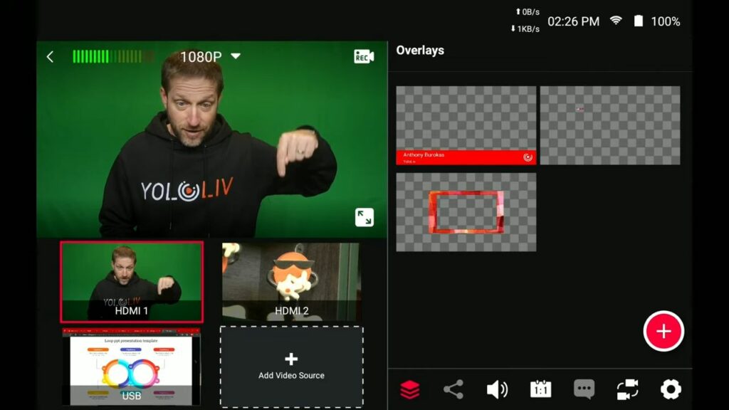
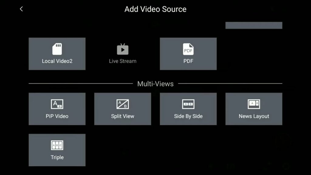
The really cool thing is the YoloBox treats these multi-views as a finished camera source. So you can build them and have them all set up and just touch them as you do with any other video source in the YoloBox. So let’s build one click on that. Now you’ve got picture-in-picture video, split view, side-by-side, news layout, and triple. Let’s go with a picture and picture video.
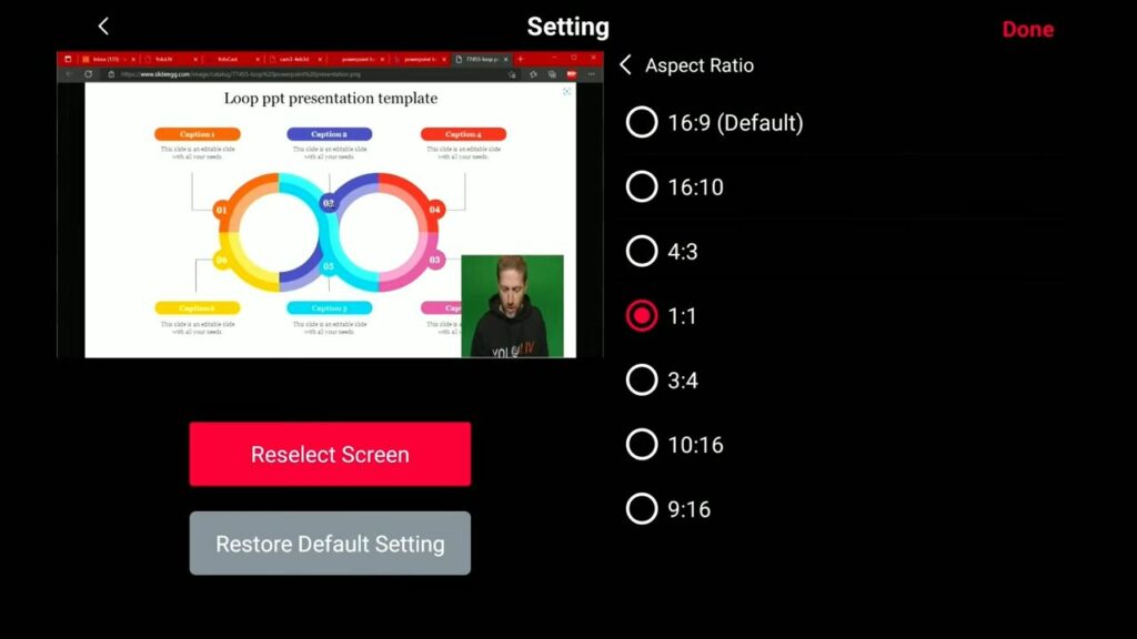
First, you pick the background/foreground. I want to point out this option called the aspect ratio. If you just have one person talking, you don’t need all this wasted space on the side. so you can get rid of that and open up more space for the graphic element which is behind you. The way to do it is to click on the aspect ratio and go 1:1. Now you can see this takes out less room and you can kind of tuck it into the corner a little bit more. In that way, you’re using up less screen real estate for the person talking because it’s vertical.
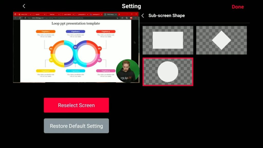
You can even get pretty extreme. You can go 10 by 16 and just have this tall window with a person talking and for a lot of times, that’s really all you need especially if it is going to be fairly close to the camera and talking like this way. You can see them talking while you still have that face-to-face connection. But then you’re also leaving a lot of room open on the screen for the content. With the sub-screen shape, you can now pick different sizes like a circle, and then move the subscreen around whether you’ve got less stuff on the left or less stuff on the right to the appropriate corner.
Now you can see right here at the bottom, that this exists as a ready-to-go source. When I want to talk about my PowerPoint I just literally touch that and I’m ready to go. I don’t have to like build it on the fly. This is a multi-view and it exists just like I can go back to me on my camera.
Multi-views With Green Screen
You can’t do this on the original YoloBox because it doesn’t have a green screen while the YoloBox Pro does. I have the YoloBox pro keying out that green background, so I have this background being placed into the original YoloBox and put myself over top of it. Now I have put myself over the other source, the original YoloBox choice. But you can see there’s no box around me because that was removed.
The camera source has a green background that has been removed. so it’s literally the only thing that gets passed through is me. It actually provides a much different view if you choose to go with the circle. Now the circle in my case has that green background but normally you would have some other background behind the person.
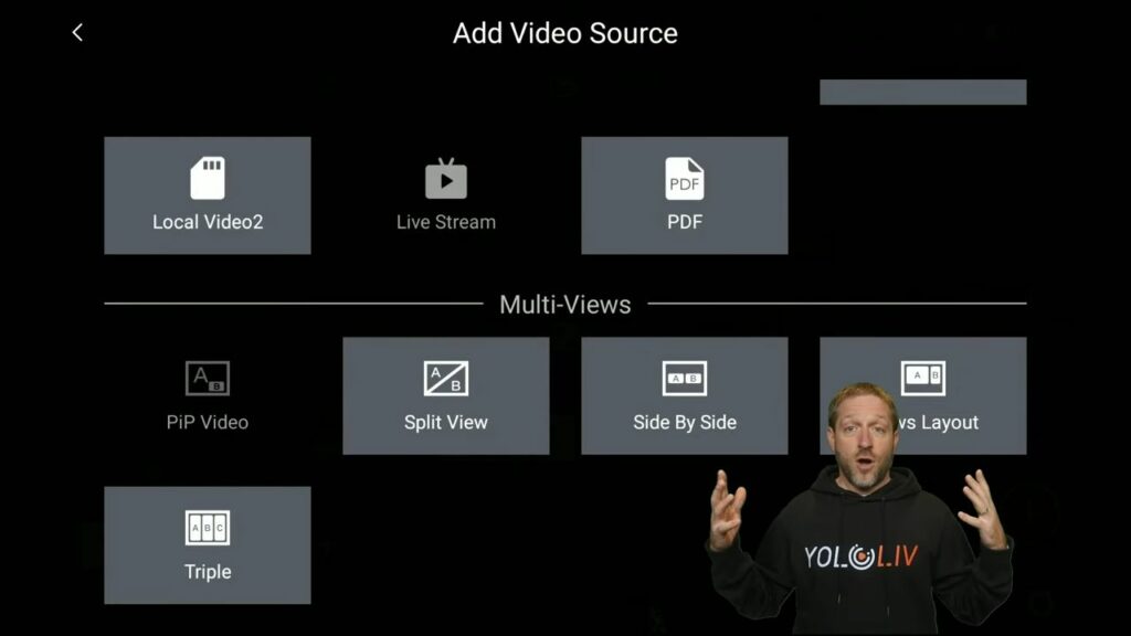
But I wanted to show the difference when you have a green screen. You do this picture-in-picture, now all of a sudden I’m able to just float over the top of the background and that is a very cool way to just refer to your side-by-side or the news layout. I can just point to these things as if I’m able to touch them which I can’t. Because as you saw on the other camera I have a green screen behind me.
Again this is the original YoloBox where I cannot key out the green screen that’s behind me. And when I do a picture-in-picture, this is what you get. But if you had a wall behind the person, if you had a bookcase or something else then this would look perfectly appropriate.
Split View
The next one is the split view. We have these two cameras and we’ve got the split view, having this conversation and both side-by-side. You can change the border thickness, and the position——one side or the other gives it a little bit of weight to it. If I want to give more weight to myself, I can give more weight to the other person or to the guest person, and then I could just be talking about this. you can also add an angle although I don’t find this as useful to it.
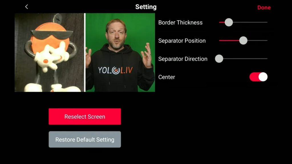
The center button means that it’s going to center up each of these sides to the middle. If you turn that off, then my camera is going to be moved over there to the middle watch. I’m over here but this the center is the other way is over there. If you hit the center, that means it puts the center of the camera in that visible area, and pretty much you’re going to want this all the time.
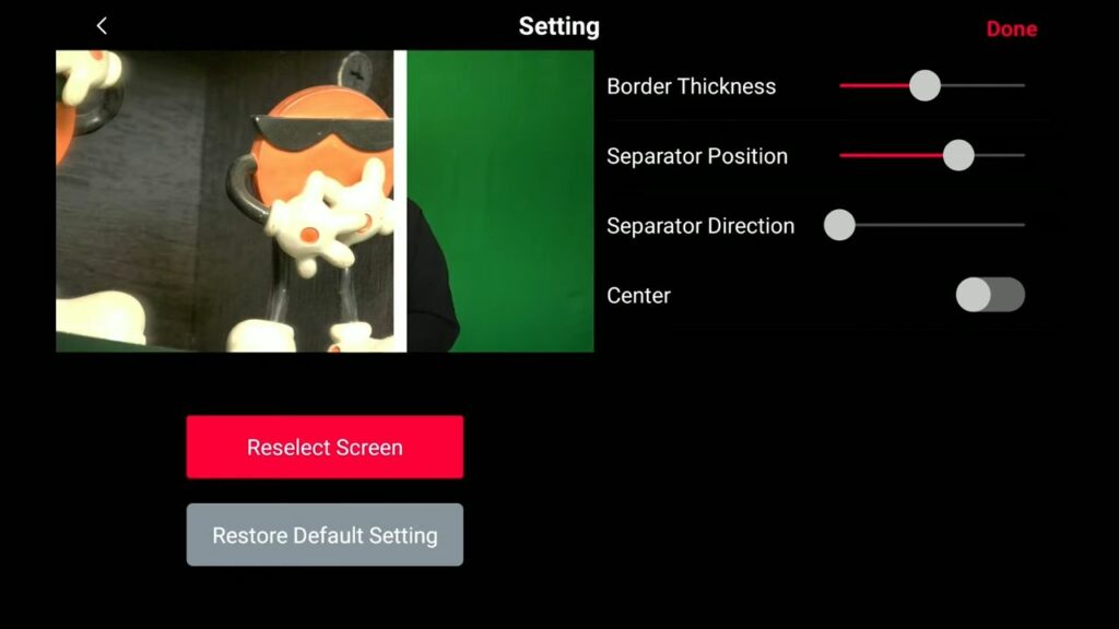
As you can see these multi-views are adding up down here. I get to keep multiple multi-views at the ready. You’re not limited to just one multi-view. I’ve got a split view and a picture-in-picture video.
Side-by-Side
Let’s add another one side-by-side. I can put a generic background like a chalkboard and can adjust the spacing of those two and now you bring that up.
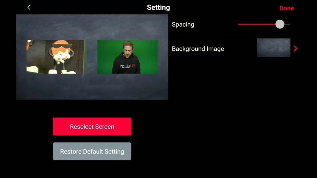
You can see I’m talking here and my guest is over there and we can have this conversation, but this looks kind of boring honestly. I’ve prepared for that. This is where with the backgrounds you can start to dress this up a little bit. Let’s hit the little right icon. We’re going to reselect a special guest and do side by side again. First, I want me. Then I want Rebecca Ferguson and select a different background image.
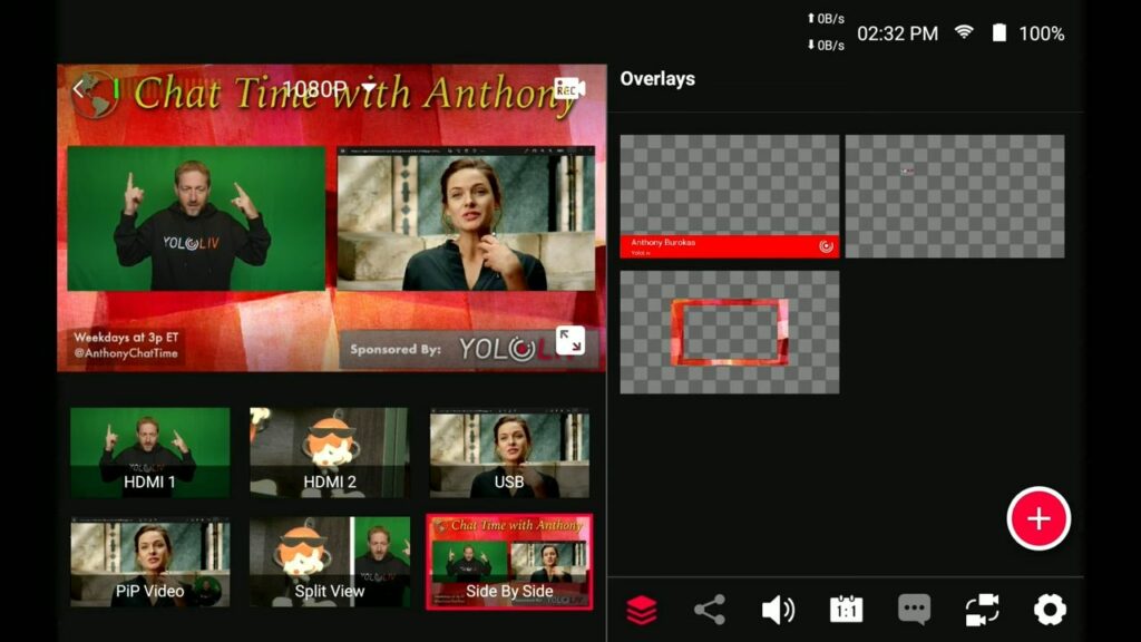
This kind of looks like a show and all that is is a simple jpeg. but I made this jpeg ahead of time. It’s got a title, some information down here on the left weekdays, a sponsored by over there in the corner, and I could have a chat with someone while having this pretty background behind us.
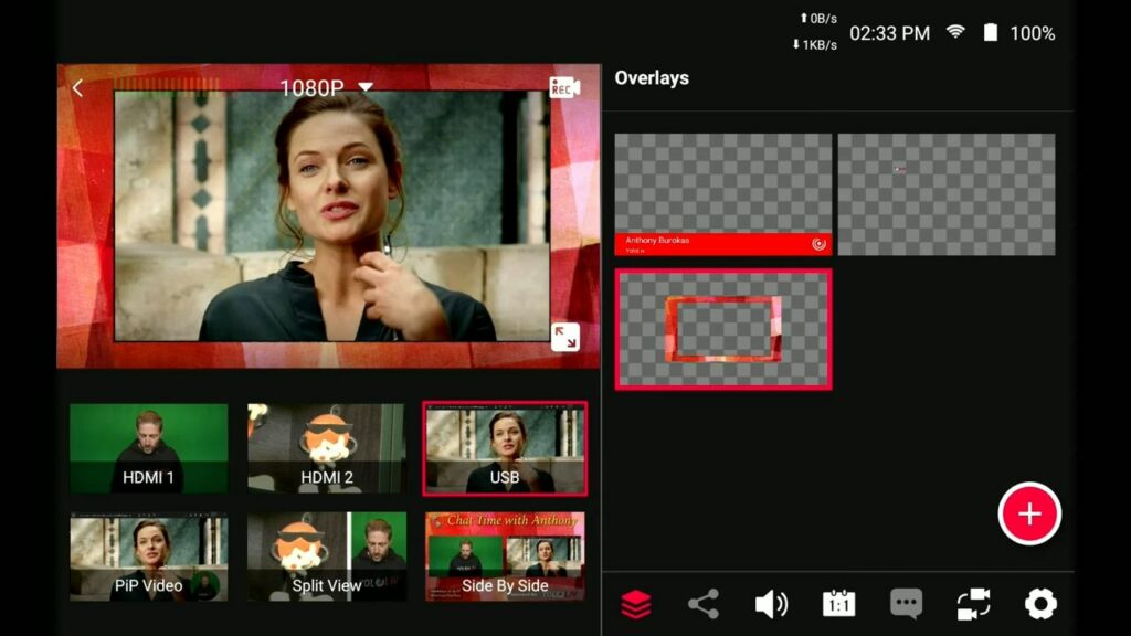
You could also dress up in the foreground. let’s just say I want to bring her to the foreground because she has her own camera which is right there. And I can add this overlay, so then this kind of ties in with the theme of the show (it has the same look as the show). And then when I want to go to the multi-view, I go there and I take that off. Now we’re having this conversation. Or if you’re going to edit it, you can just edit in between those moments, and then it all looks perfect.
News Layout
Next up is the news layout. as you can see I am talking about my PowerPoint which is right to my side and then you can add a background image. again I’ll choose something nondescript. So that’s fairly dark done. and that is available right here as a camera view. and this way I could be talking about this particular PowerPoint.
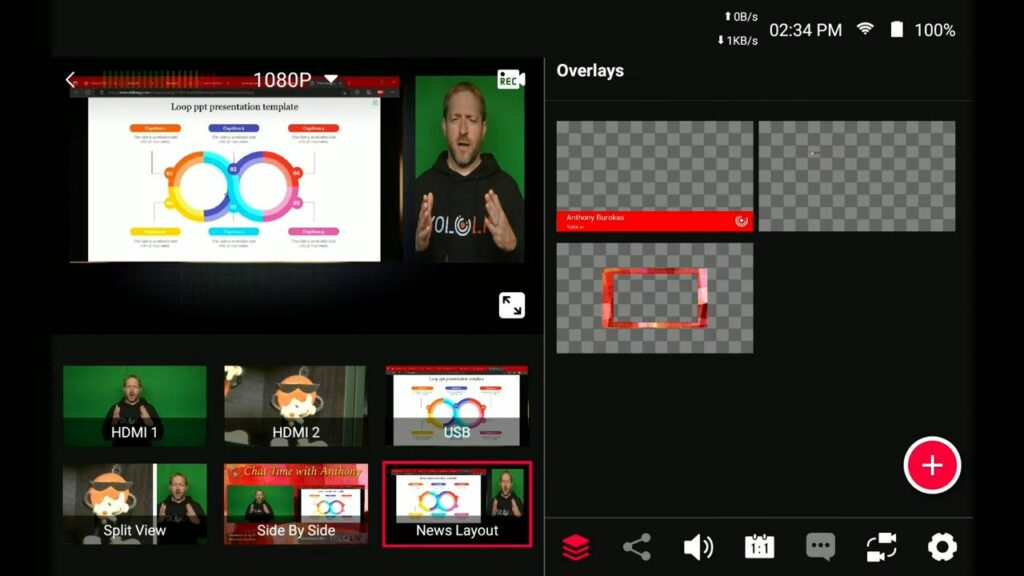
Like I says I find the picture-in-picture to be a little bit better for this. But the news layout does preserve this format so it’s 16 by 9 and it stays so that you can have a little window for the person talking about it.
The Triple
The last one we have to bring up on the screen is the triple. This is good because, in the original box, you’ve got three inputs. And I’m using the laptop for one. But with a USB adapter, that could be three cameras so you can have three people side-by-side all talking to you on the screen.
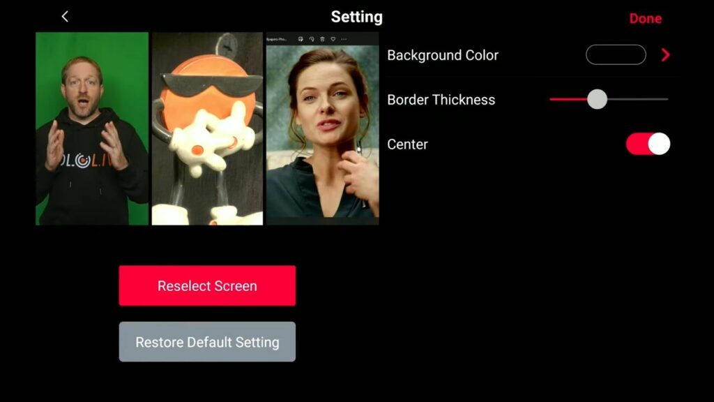
Here I have a background color, border thickness, and center. Again the center is centering up each of the inputs into their slot if you turn that off. you can see why you want to center those images, that will put the center of the source into the center of that vertical slot. So that’s a really important piece of information.
Special Function in YoloBox Pro
Now you can see that when I bring this up, I have more multi-views and that is because now we are looking at the YoloBox Pro which gives you 2 picture-in-picture, 2 split views, 2 side-by-side, 2 news layouts, and 2 triples. That is a lot of things going on.
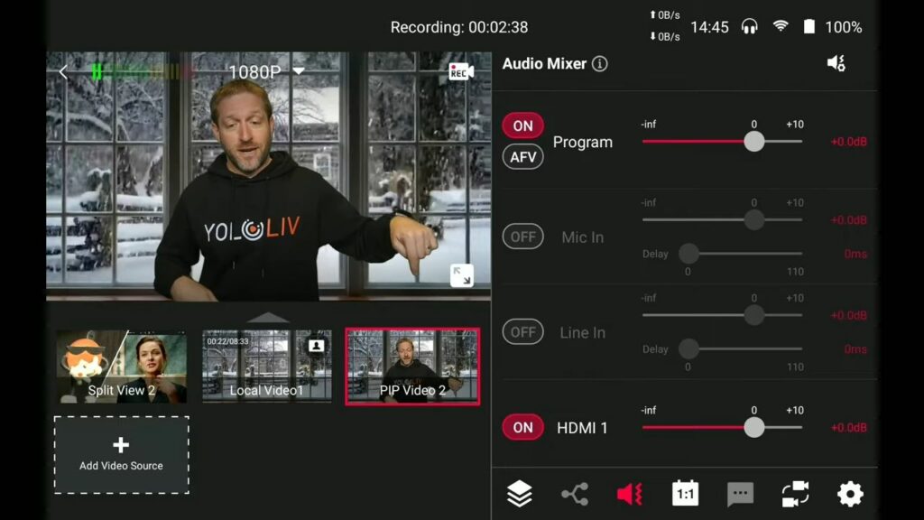
Now I have a little arrow at the bottom of this. We’re going to add many sources including 2 split views, local videos, and picture-in-picture with the video background+me. As I’ve shown before, you can adjust the scale of the overlay. When you bring that up, it’ll automatically play the background.
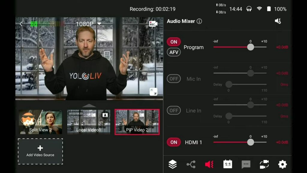
Here I am in front of my winter. Actually, it’s 100 degrees outside because I’m in texas right now. But I’m in front of this winter scape video behind me and I’m using my green screen key, so it removes the green and places me over the video using this picture-in-picture right here.
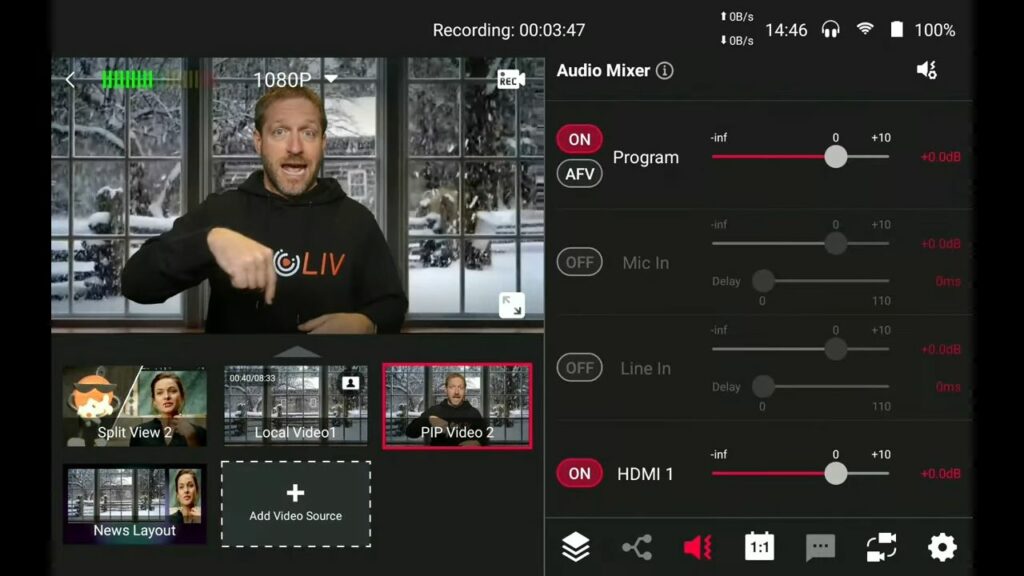
This arrow is the key thing that I wanted to show you with the Pro. I already have so many videos stored on the other side. If I click that up arrow, you can see I’ve got my three cameras. But then I’ve got my first picture-in-picture video, my second split view, and my triple. If I hit the down button, I’ve got my second split view, the video, my picture-in-picture video with me over that. And you can keep adding things. let’s do a news layout with the video next with Rebecca. You can see we put a background on there and done. She can be talking about the snowy weather where she’s at.
You can see I’ve got two pages of sources down here, and I can flip between them. I already have 10 sources in the Yolobox Pro, and I have the ability to add more. With that little arrow, I can go up and down between those pages of sources. You can use all of these multi-views to create different looks, capabilities, and ways of presenting your information, especially when you come up with cool overlays.
Let’s Wrap Up
This is how you can really dress up your show with overlays with backgrounds and with all the other assets that we talked about in our graphics video. This has been a look at the multi-views built into the YoloBox.
To know more about Yololiv tutorials and reviews, subscribe to our YouTube channel here: https://www.youtube.com/c/YoloLivTech. Enjoy more videos from Yololiv!
Cerise is a support specialist at YoloLiv with three years of experience working as a Customer Support Specialist in the consumer electronics industry. She also produces articles including video productions, tips and tricks and expert knowledge in the audiovisual industry.


